SteamPowered app
Redesign Project

Timeframe: 5 days
My Role: UX/UI Designer
Objectives: Redesign the SteamPowered mobile
app based on heuristic evaluation.

.Heuristic Evaluation
As for the first step of the project I’ve made a heuristic study on the application to cast its main deficiencies.
Throughout the app, 18 main problems were detected, they were mainly around consistence and aesthetic.
The experience is filled with overcomplicated menus and submenus, information scattered all over the navigation. Redundancies were present everywhere.
.Minimalist design
Great number of categories and filters, many menus and submenus
Navigation can get very complicated even for the expert users of the app. Decentralized information, sometimes some of the menu options just applies filters to the store, and some drive you to pages located in the nav bar. Three different menus can be found at the home page.
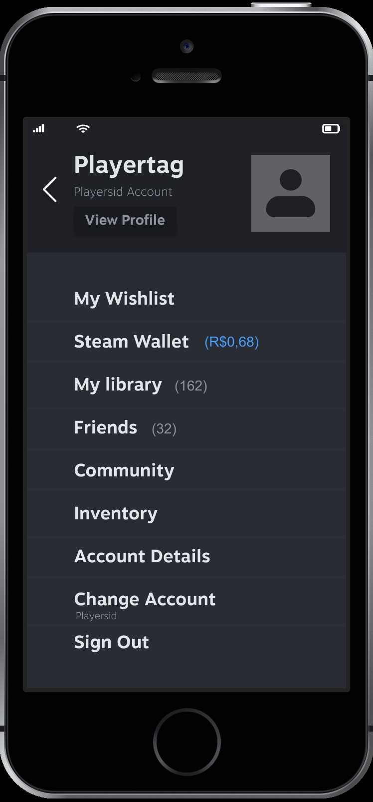
So for this project I had the challenge to reorganize the information architecture of the application. And simplify the whole experience for the user. My main focus was to make the experience clearer for the newbies and the veterans users. So I had come up with the following prototypes.
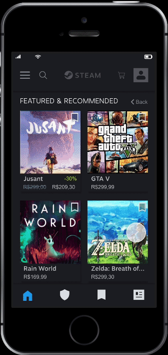
In the store you can navigate inside the sections and bookmark any game you desire
Simplified menus. Rework on the information architecture for a more friendly user navigation.
For next steps in this project, I would like to do a complete rework on the information architecture on the platform. Maybe with simple changes on shortcuts and information the whole experience can be less confusing and more satisfying. For both, experts and newbies.
.The story
Steam powered was the first and probably the biggest online game store in the market.
It has started as a desktop app. With the arrival of modern mobile phones and the popularization of phone apps, Steam has also developed a mobile application for their shoppers.
Translating all the information of the desktop app
to a smaller screen has brought many challenges.
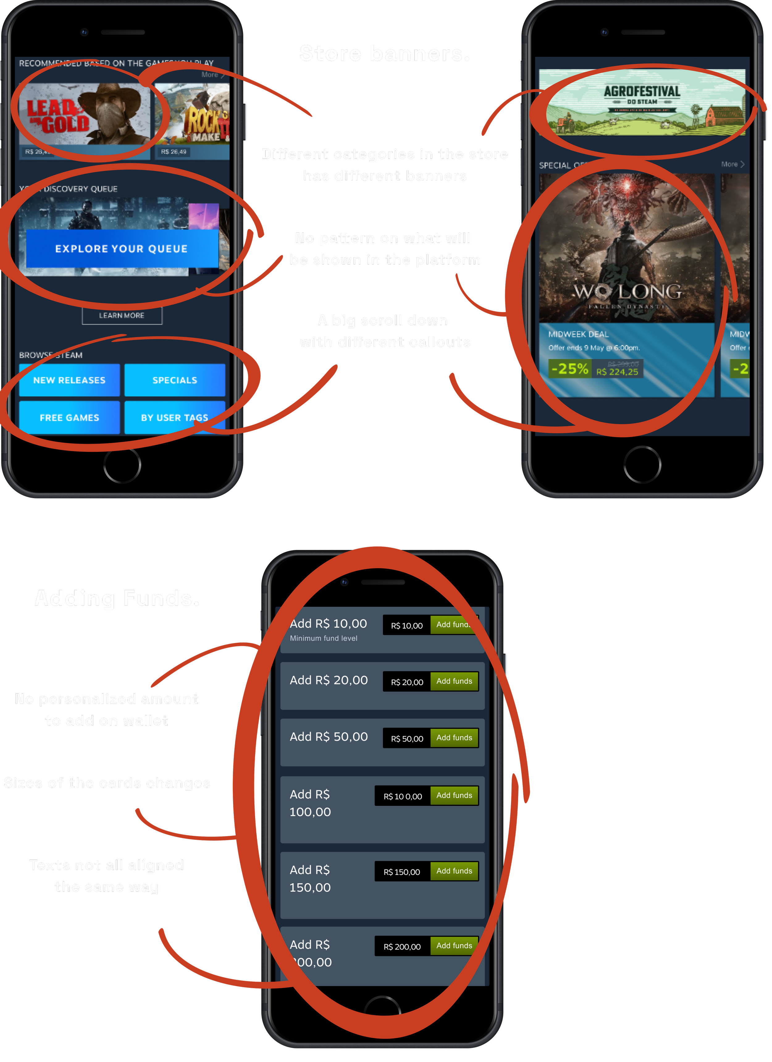
.Inconsistency
During the navigation, the app presents to you a variety of banners and cards, with different sizes, fonts and alignments.
It is hard to find a pattern in the whole experience. Making it hard to connect sections or banners to places inside the store. Making navigation complicated and unpredictable

.The challenge
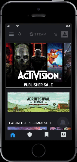
More consistent banners.
Separated in categories. From higher to low priority on the store display.
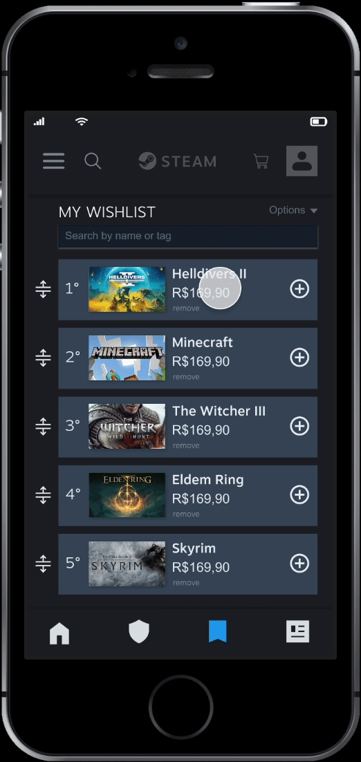
For the wishlist only the drag option was maintained to arrange your wishlist. An add to cart button was added and all writings in the same pattern.